How to Improve Your Prints (Basics of Color Theory)
In the world of graphic design, printers need to fully understand how colors work together to create the high quality print that the client expects. As a potential client, it might be helpful for you to educate yourself a little bit about color theory so that your design will look great in both print form or on the internet. This guide will help you get started and there are many different resources available on this topic.
The Basics
There are two main methods that are used when mixing colors, but they both work on the same concept. Almost every color in this world can be broken down in three basic colors. These are known as primary colors and the degree to which they are mixed will produce different shades. For example suppose that you want to make the color yellow. In order to make yellow you would need to mix the color red with the color green. The degree that you mix the red and green will determine the different shades of yellow. More red will make a brighter yellow, while more green will make the yellow darker.
RGB
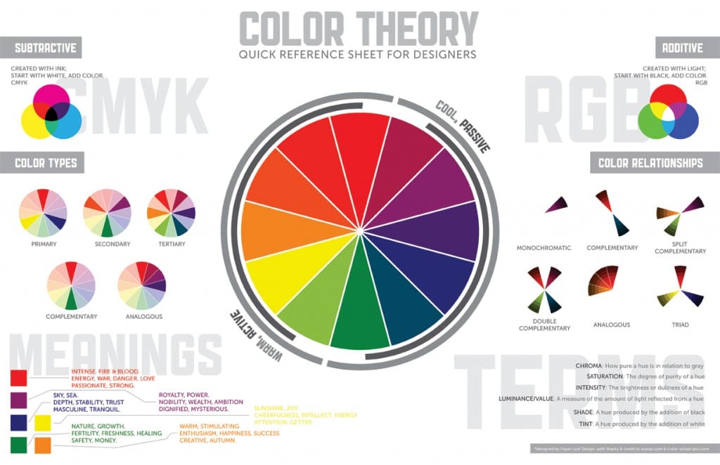
RGB (Red-Green-Blue) is used most commonly with computer graphics. The reason red, green, and blue are used is because those are the three primary colors of light. When red light, green light, and blue light are shined together at full intensity, you will get white light. Since computers use monitors that project light from the screen to your eyes, it makes perfect sense to use the RGB scale for computers.
The is particularly true with web design. In web design, the designer will want to use web safe colors to ensure that every user’s computer monitor can display the colors. If a designer doesn’t use web safe colors, then a website might look abnormal when a user visits it. Page layout can be a little more tricky because a layout will look darker when it is printed on paper. Keep on reading to find out why that is.
CMYK
When printing on paper, like in situations like business card design or poster design, a person might design an amazing looking layout on the computer only to find out that it looks dull or abnormal when printed. Unlike a computer screen, which projects light at us, a piece of paper absorbs light and reflects it. When something looks green in the real world, what you are seeing is that object absorbing all light except the green light. When the green light is reflected back to your eyes, the object looks green.
This means that printed colors are generally darker than computer colors. Printers will use Cyan, Magenta, Yellow, and Black as the primary colors. Most page layout programs will offer a CYMK value for a color so that a graphic designer can match computer colors to paper colors. A common tool that most graphic designers keep handy is color swatches so that they can see what the color looks like when printed.
Here’s a neat quick color reference guide:


0 Comments